Logo Creative Idea
A single mark.
A profound meaning.
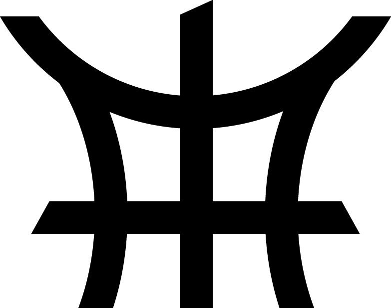
Inspired by the expressive elegance of Japanese calligraphy, the Mageba Empire identity embraces the belief that a single stroke can carry profound meaning. Every line, curve and connection has been designed to tell a story of legacy, leadership, heritage and generational growth.
01The Monogram
Many businesses.
One cohesive symbol.
The icon fuses the M for Mageba, an inverted E for Empire, the M for Media, T for Technology and the P for Property. The forms do not stand apart; they connect as one empire, one vision and one shared legacy.
02Isibaya
The heart of
the homestead.
In Zulu culture, Isibaya is more than a cattle enclosure. It is a sacred ancestral space connecting past, present and future—a place of gathering, protection, wisdom and belonging. It is the foundation upon which an empire is built.
03The Horns
Prosperity with
responsibility.
The circular structure of the traditional kraal meets the visual language of bull horns. Together they preserve the original symbols of wealth, strength and heritage while expressing leadership, influence and stewardship.
04The Formation
Strategy. Unity.
Discipline. Vision.
A subtle reference to the renowned battle formations pioneered by King Shaka kaSenzangakhona Zulu brings the qualities that define both great kingdoms and enduring businesses into the mark.
05The Pillar
The backbone
of the empire.
The central vertical line represents the wooden log that gives Isibaya its strength and form. It grounds the group in its values while holding its businesses together and supporting future growth.